Okay can we all agree that picking a paint colour is kind of obnoxious? And perhaps even more so for cabinetry?There are so many factors that go into selecting a paint colour. If you get it wrong in one room – no biggie, it’s not that difficult (or expensive) to paint over. But to get it wrong on cabinetry? Yikes. That repaint will be no easy task.
So where to start when trying to select a kitchen cabinet colour?
Dark vs. Neutral Cabinetry
In my view, you can’t go wrong with either dark or neutral cabinetry. Both are classic in their own way, it’s all about what speaks to you. What kitchen images make your heart flutter? I adore the statement dark cabinets make, but I also knew the look is not something I could live with long-term. If bold cabinetry is your style, get it girl. If you’re all about that neutral vibe, read on.
How to Narrow Down Your Colour Choice
For our own kitchen I poured over image after image of kitchen inspiration to help me narrow down to a few contenders. While an online image doesn’t provide an exact colour depiction, it sure beats bringing home a dozen paint colours to sample (read: be confused by).
For me, using inspiration images to narrow down a paint colour choice will always, always beat looking at a paint deck or standing wide-eyed at the endless rack of paint chips at the store. Those paint chips are tricky little things, looking at two square inches of a colour is very deceptive and it’s incredibly difficult to visualize exactly how that colour will look once painted over an entire room.
And if I do happen to be lured by a certain colour in the paint deck, I always hit Pinterest first for inspiration images (just type the paint brand & colour name into the search bar) before running out to grab a sample. I think of it as quickly vetting a colour before you bring it home to see if it works in your space.
So let’s dive into those kitchen cabinet colour inspiration images, shall we?
6 KITCHENS THAT PROVE NEUTRAL CABINETRY IS ANYTHING BUT BORING
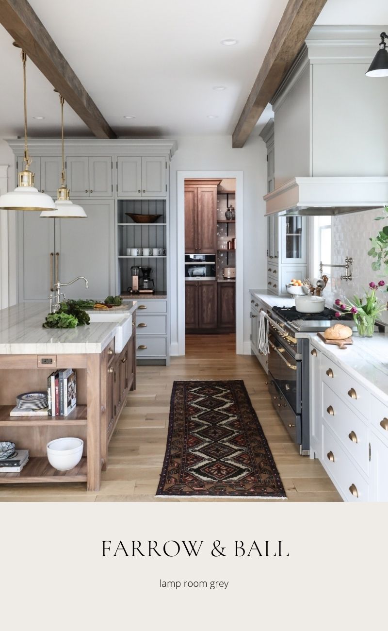
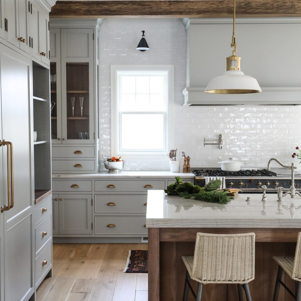
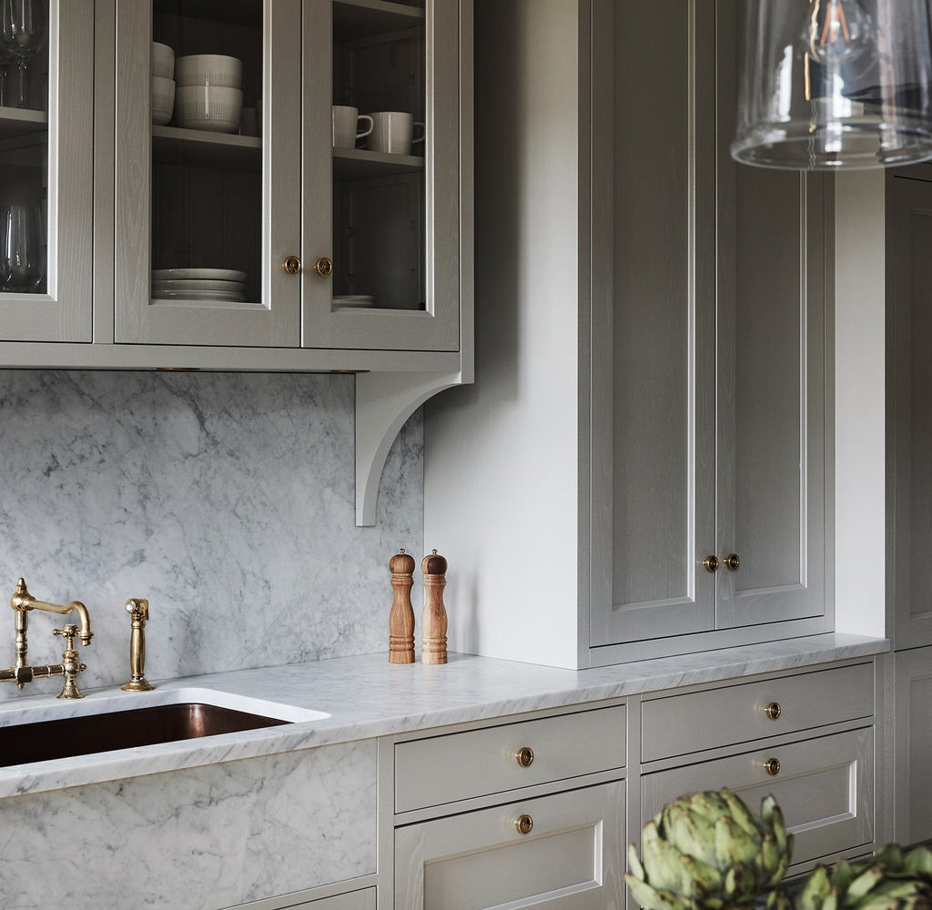
FARROW & BALL: LAMP ROOM GREY
Lamp Room Grey is a soft grey that leans slightly blue. As you can see in this stunning kitchen from Park & Oak, Lamp Room Grey pairs beautifully with warm tones – the wood island cabinetry, the floors, and beams and brass cabinet hardware.
The warm tones balance the cool tones of cabinets to create a beautiful neutral space. The overall effect is soft but statement-making.
LITTLE GREEN PAINT: COOL ARBOUR
There’s a lot to love about this kitchen – the heavily veined marble, the beadboard behind the shelves, the charming pot rack, to name a few, but to me the cabinet colour is the standout.
Are moody-neutrals a thing? I think this kitchen proves they in fact are. That slight khaki-green undertone gives this neutral kitchen depth & intrigue.

PORTOLA PAINTS: FIGUEROA
This sandy-almond colour is very of the moment and yet classic enough to have some serious staying power.

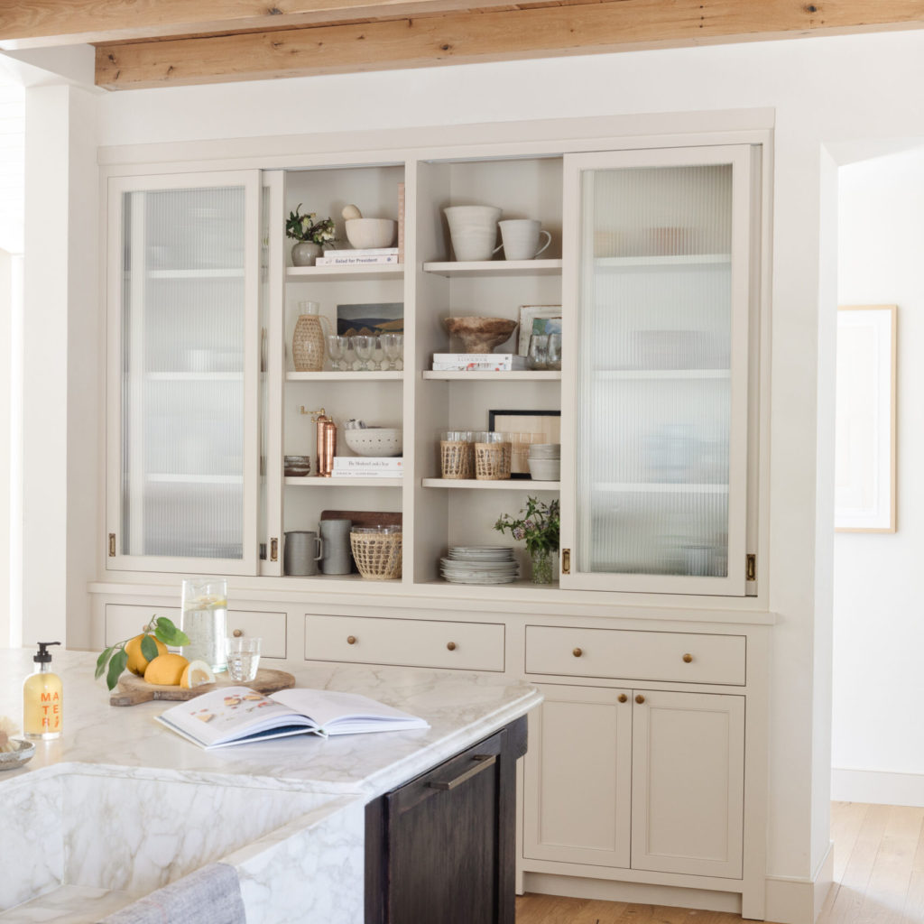
The built-in hutch showcases the cabinet colour beautifully, while the sliding reeded glass doors keep the area from feeling too heavy.
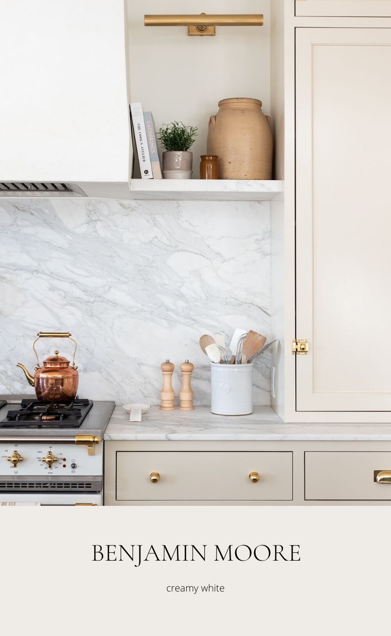
BENJAMIN MOORE: CREAMY WHITE
As you might guess by the name, Creamy White is an off-white that warms up a space while still giving the light and bright vibe of a white kitchen.
If you’re feeling a little daring, pair with a dark island, as shown here, or keep the look seamless by painting all the cabinetry in this same shade.
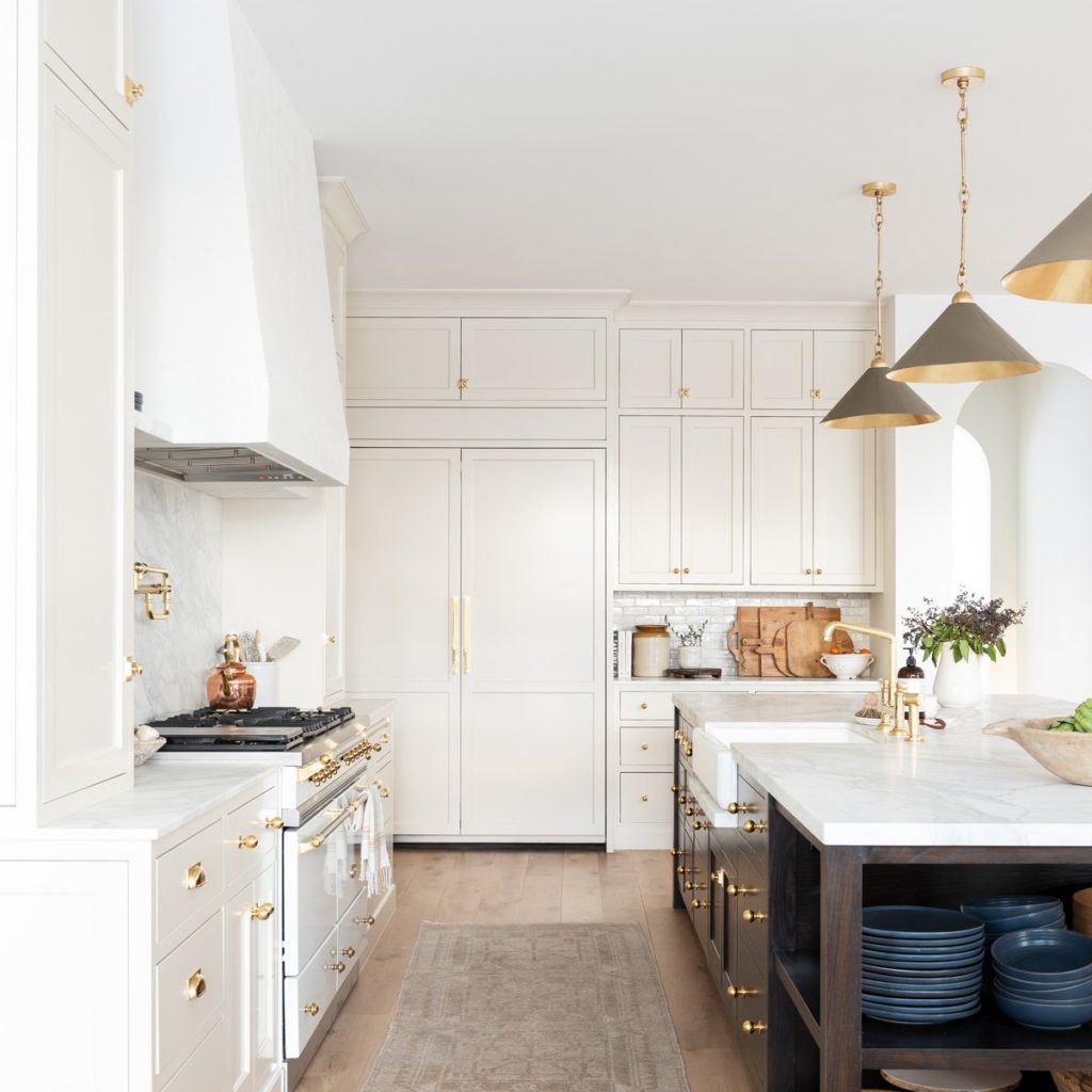
BENJAMIN MOORE: CHANTILLY LACE
If you are after that true-white kitchen look, picking a white with the right undertones is critical (imagine painting your entire kitchen and then realizing the white you picked has purple undertones. *shudder*). Chantilly Lace is a gorgeous neutral white with minimal undertones. It is my go to for a crisp-but-not-cool white paint for walls, and it looks equally as chic on cabinetry.

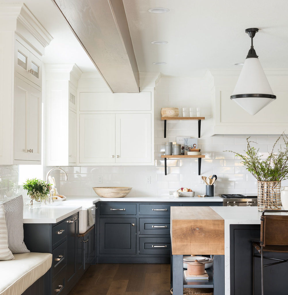
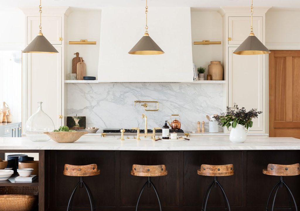
BENJAMIN MOORE: REVERE PEWTER
Call me bias, but Revere Pewter might just be the perfect neutral for kitchen cabinets. This greige tone – warmer than grey but cooler than beige – adds a subtle cozy vibe to the kitchen and pairs beautifully with brass hardware.

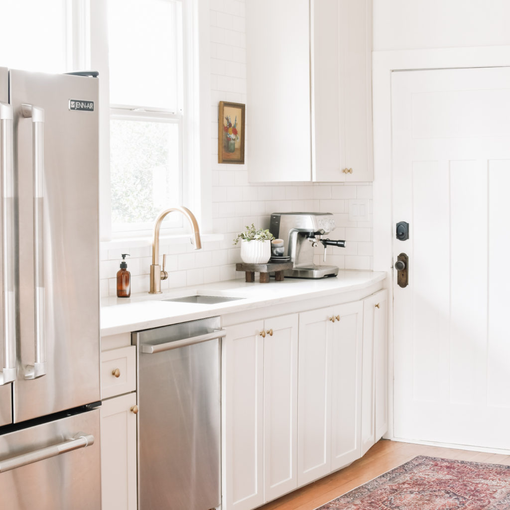
After much research and consideration, Revere Pewter was the clear winner for our kitchen.
I’d love to know – which of these would you pick for your own kitchen??
xo,

