Our 6 Week Living Room Makeover: Before & After

WE HAVE ARRIVED! Today is the day I finally reveal our Formal Living Room makeover for the 2020 Fall One Room Challenge. It’s been a long 8 weeks, working nearly every evening to complete this space. In hindsight I see now how overly ambitious my to-do list was, with probably a few too many DIY projects planned. I also had a health scare during the ORC which set me back a week. It’s been a challenge alright, but I couldn’t be more pleased with how the space has come together. It finally feels like me, and what a feeling that is.
If you found me through the ORC site, hello! I’m Carly, a SAHM and blogger renovating our 1912 Craftsman one DIY at a time. If you missed our previous updates you can catch up here: Week 1 (design plan), Week 2 (armchair upcycle), Week 3 (fireplace & mouldings), Week 4 (built-in cabinets and stump side table), Week 5 (Cabinets, coffee table, art & fireplace).
So here comes the long (but good!) post, friends.
This post may contain affiliate links, and I may earn a small commission at no additional cost to you. You can read my full disclosure here.
Before & After
Before
Here’s a little refresher as to what the space looked prior to the One Room Challenge: first, what it looked like when we took possession back in Spring 2019 (what I like to call the original before), and what it looked like just 2 months ago.
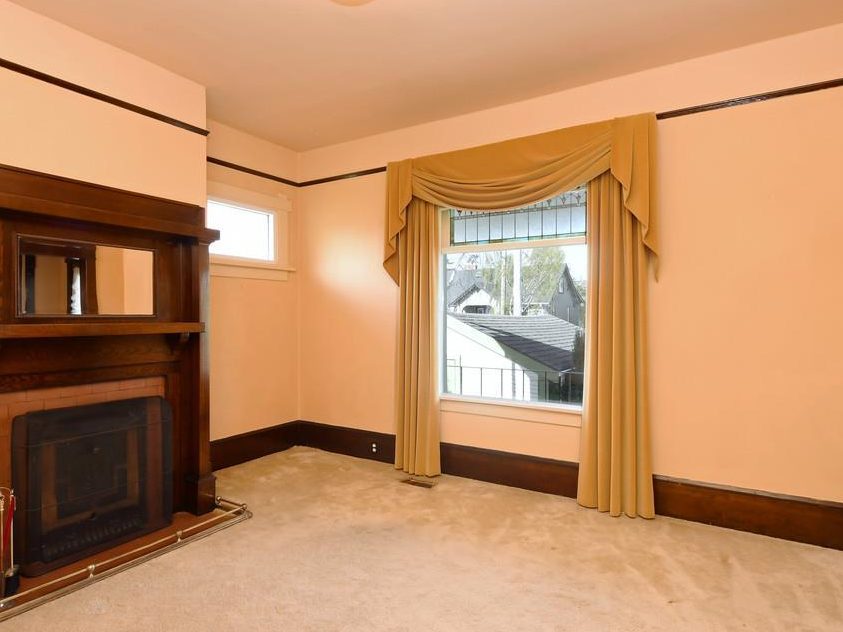
When we bought the house we painted the living room and refinished the floors, but as far as decor this room never had any thought put into it – we moved in our tired, old furniture and this is how the room looked for over a year while we focused on other projects,
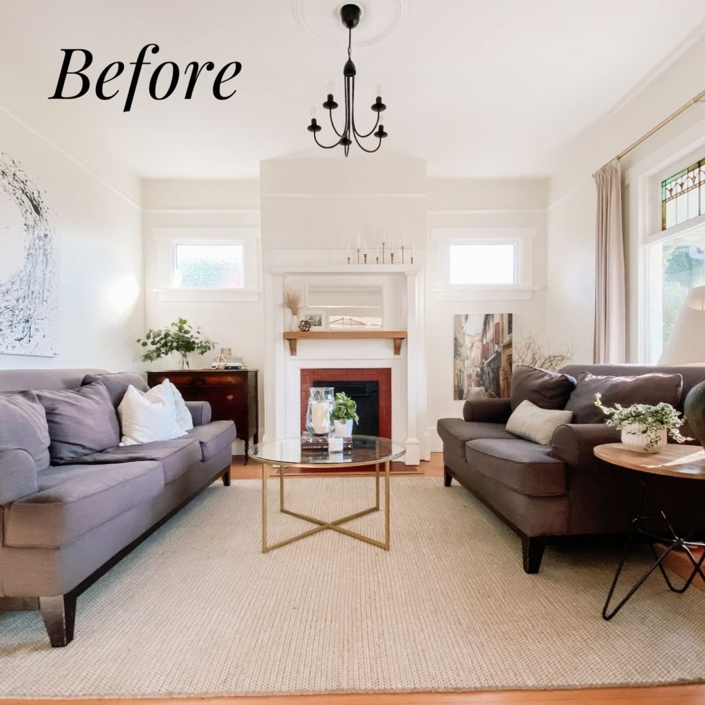
The room was fine, but certainly not living up to its potential. The furniture didn’t reflect my current style, the sole light fixture in the room was undersized, and the fireplace was awkward and calling out for built-in cabinetry with the two open spaces on either side.
My goals were to add thoughtful details which enhance the character of our craftsman home and update the decor to match my current taste, all on a tight budget. With that in mind, ready to see the after?
After
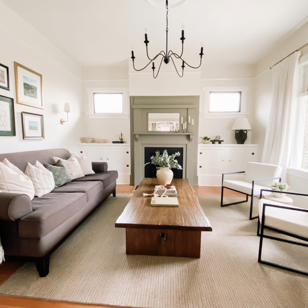
So much more elegant, right?!
Let’s chat details and design, shall we? First allow me to give you a lay of the land in terms of this room’s location and function in our home.
This room is immediately off the entryway, and serves mostly as a place to relax in the evenings or (try) to catch a quiet moment with a book in the day. We have a separate family room with our TV and children’s toys, so I didn’t have to contend with those common living room design challenges.
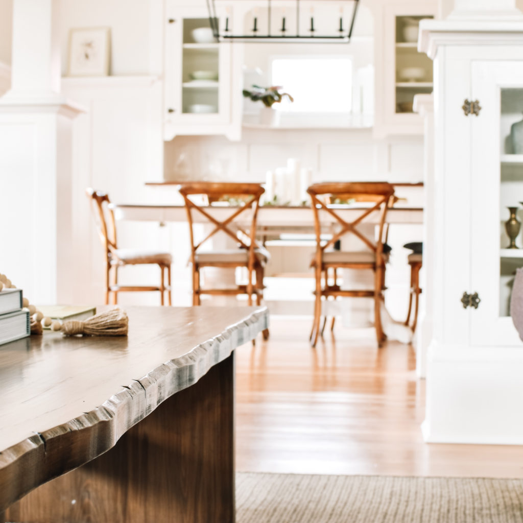
Despite the age of the home, this formal living room has a pretty open feel through the entryway and into our dining room and kitchen. While I think this room would look amazing with a more moody and dark palette, it would feel too jarring against the light & bright feel in the rest of our home. I wanted to make it feel cozy and elegant while still aligned with the rest of our home’s aesthetic.
Design Details
Fireplace
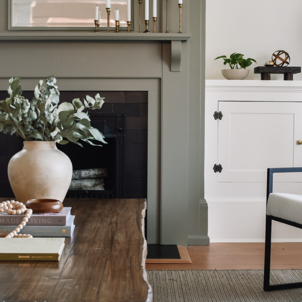
This fireplace went through quite a few iterations before landing with the design you see here. You see, this is not a working fireplace – it’s an old coal burning fireplace which we plan to one day replace with a gas fireplace. So I knew I wanted to give it a facelift without any major structural changes (those will come with the new insert).
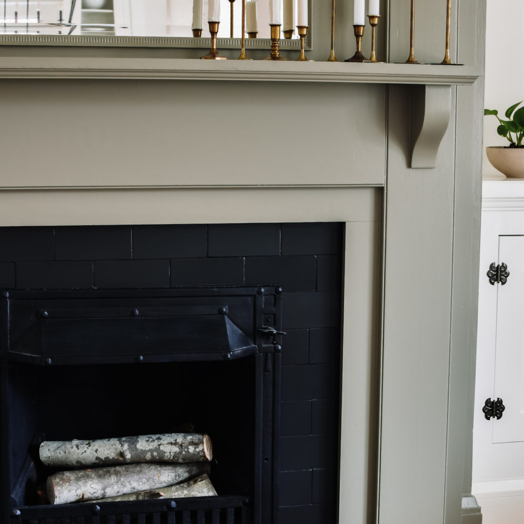
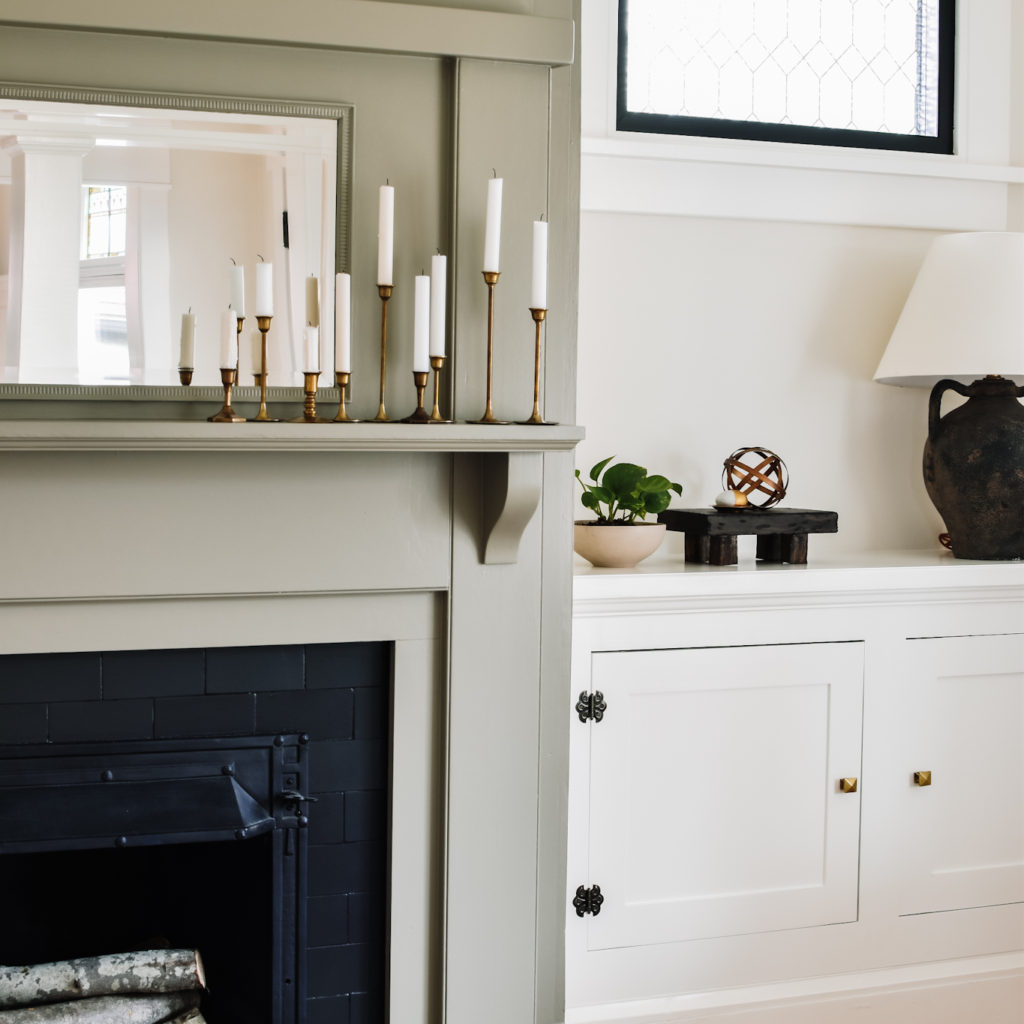
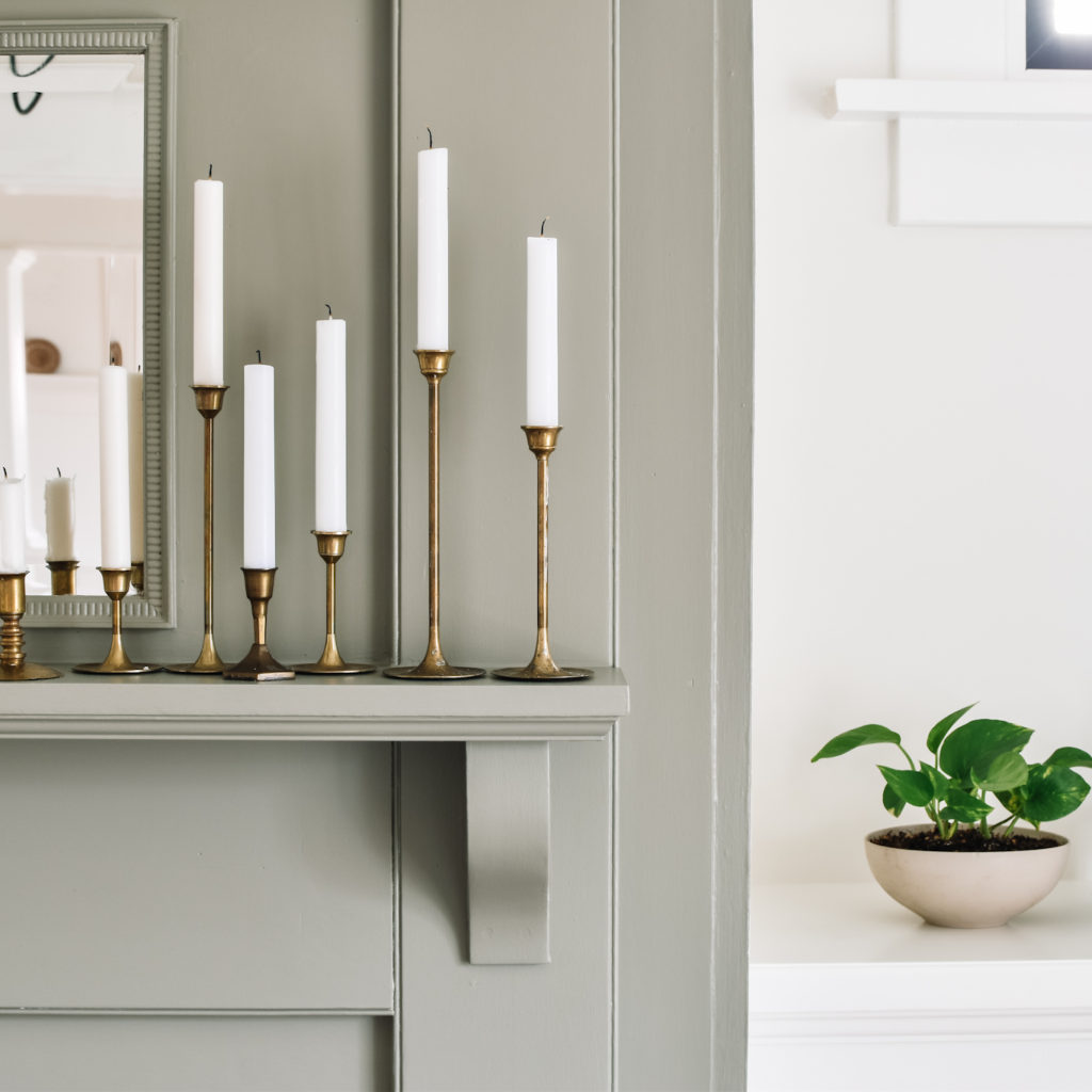
We knocked out the pillars, reworked the mantle, and ultimately repainted it a dark shade of griegy-green, Benjamin Moore Taiga. It was a decision I made in the final week to add some cozy vibes to the room, and honestly, I think it makes the space.
Built-in Cabinetry
Certainly the most ambitious undertaking of this project was building our own cabinetry. From scratch. And we’ve never built cabinets before.
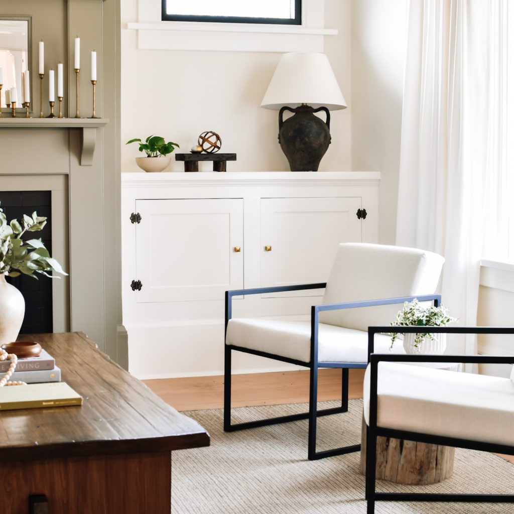
My design plan was for inset cabinet doors to match the existing built-ins in the home (such as the glass doors in this room and hutch in the dining room). We removed the existing original baseboard and salvaged it to create a skirting for the cabinetry.

It took endless hours of work, measuring and remeasuring, messing up, and trying again. We couldn’t have done it without one of our amazing friends who lent us the specialized tools to create the doors and face frames.
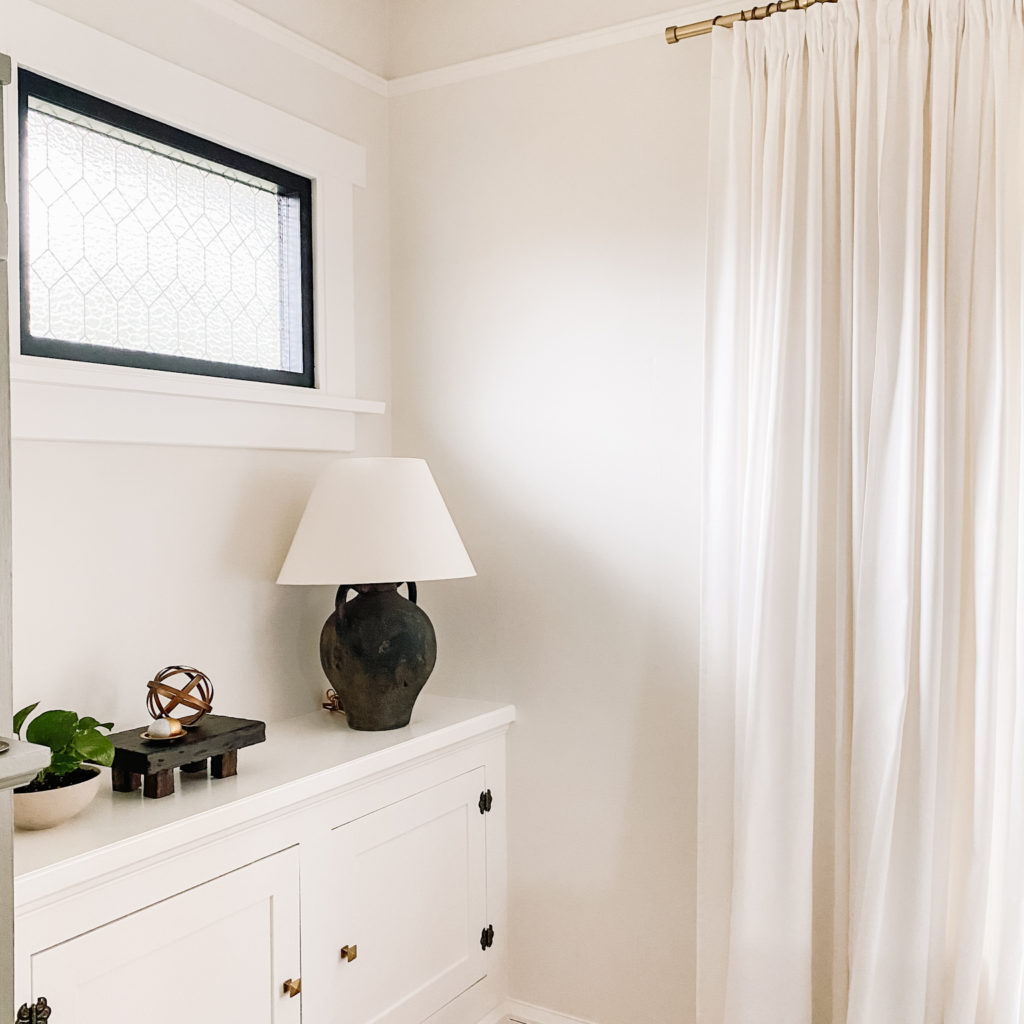
I designed them with a 3 inch setback from the edge of the fireplace to allow the fireplace to be the focal point, and to maximize floor space in the room. It is only a 14′ x 14′ room!
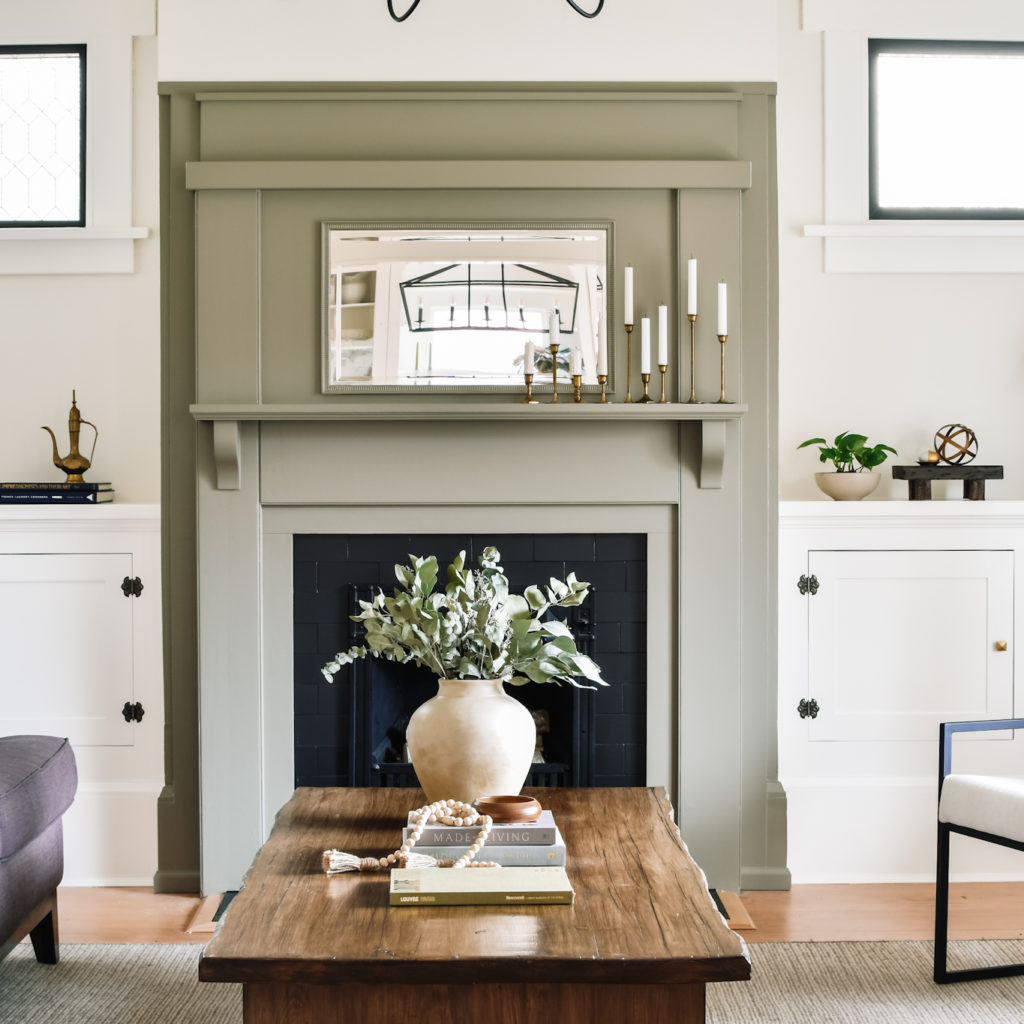
The built-ins flank the fireplace perfectly and look as though they have always been there, just as I had hoped.
Armchairs
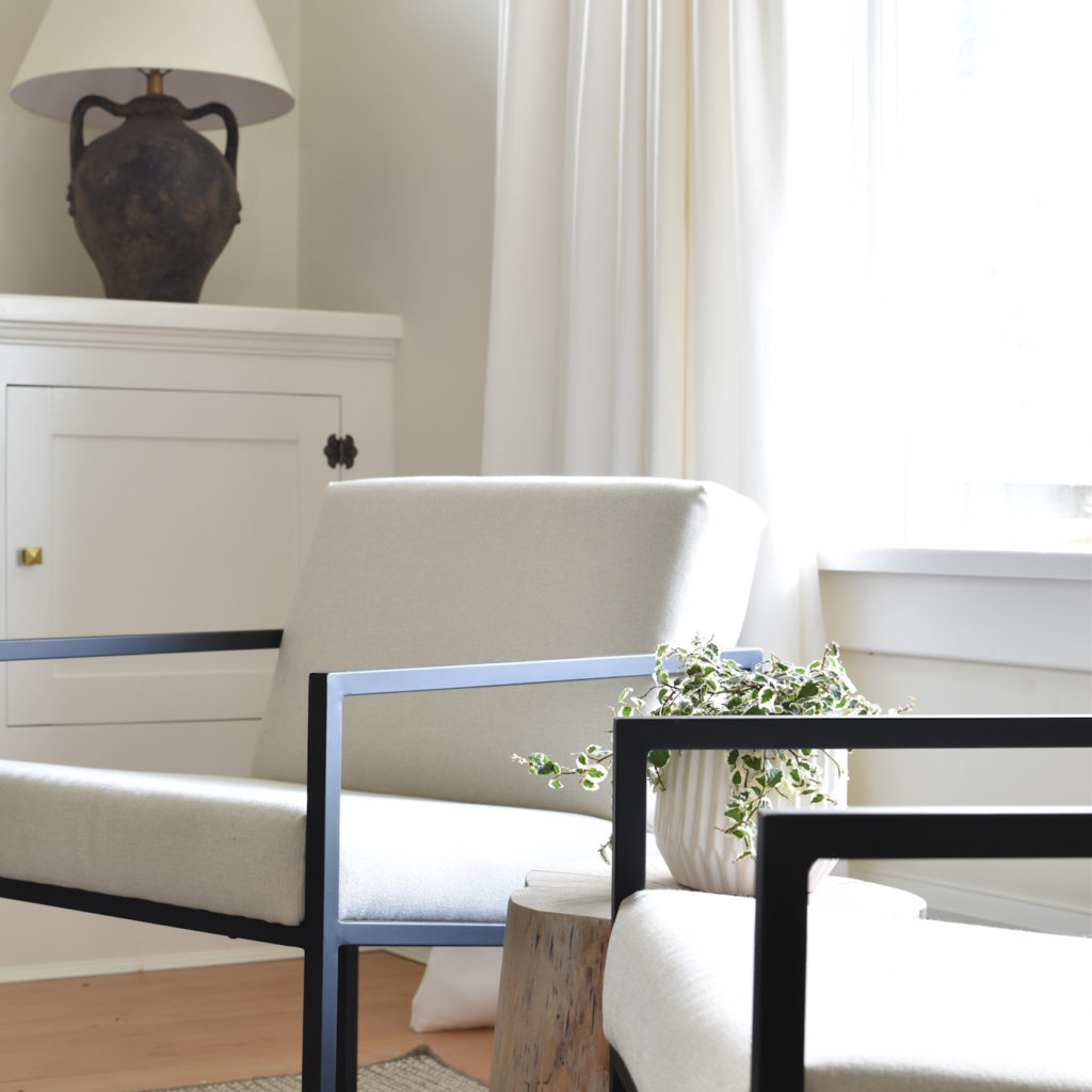
It is so wonderful to see these armchairs in the living room at last. Way back in Week 2 I painted and recovered these armchairs. $25 in supplies took these chairs from dated to a pretty decent dupe of the $1500 inspo chairs.
Stump Side Table
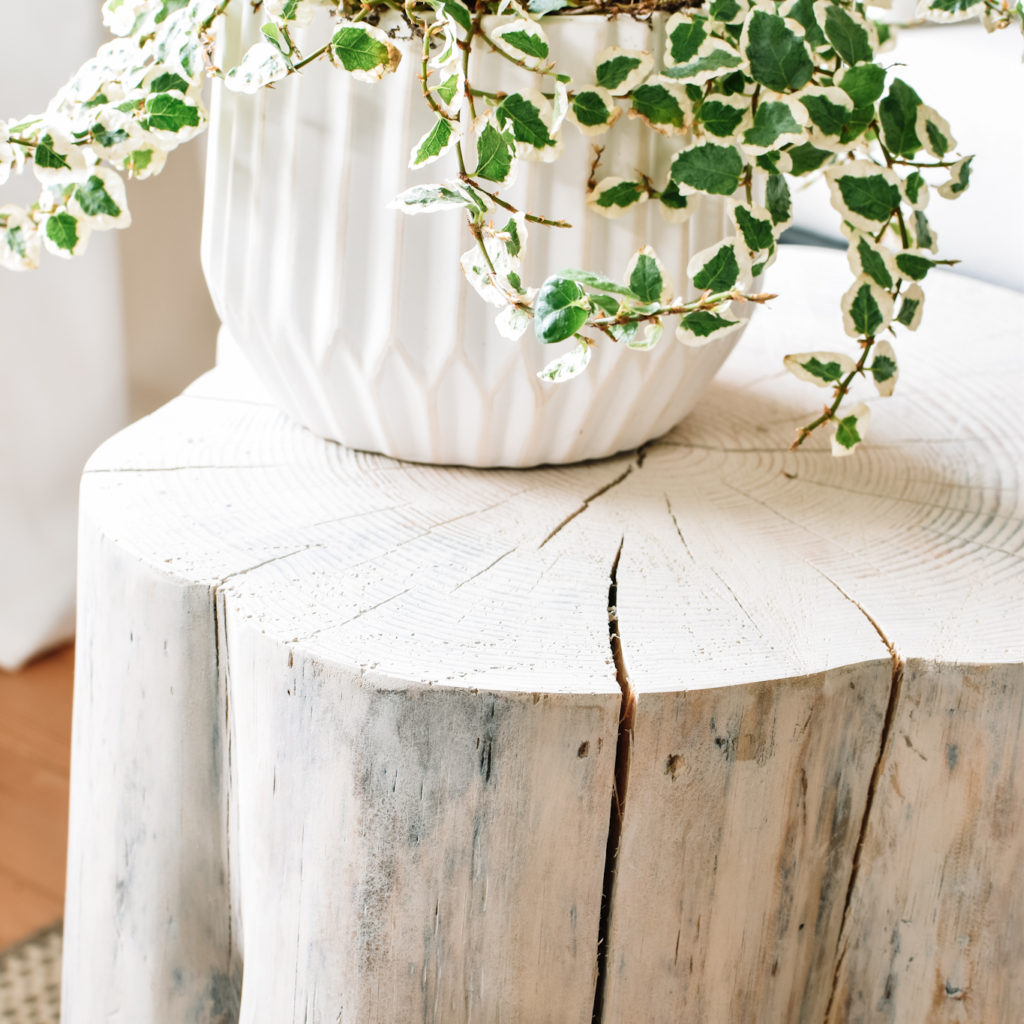
This project was another upcycle of sorts, taking a fallen tree section and turning it into a side table, inspired by this West Elm piece.
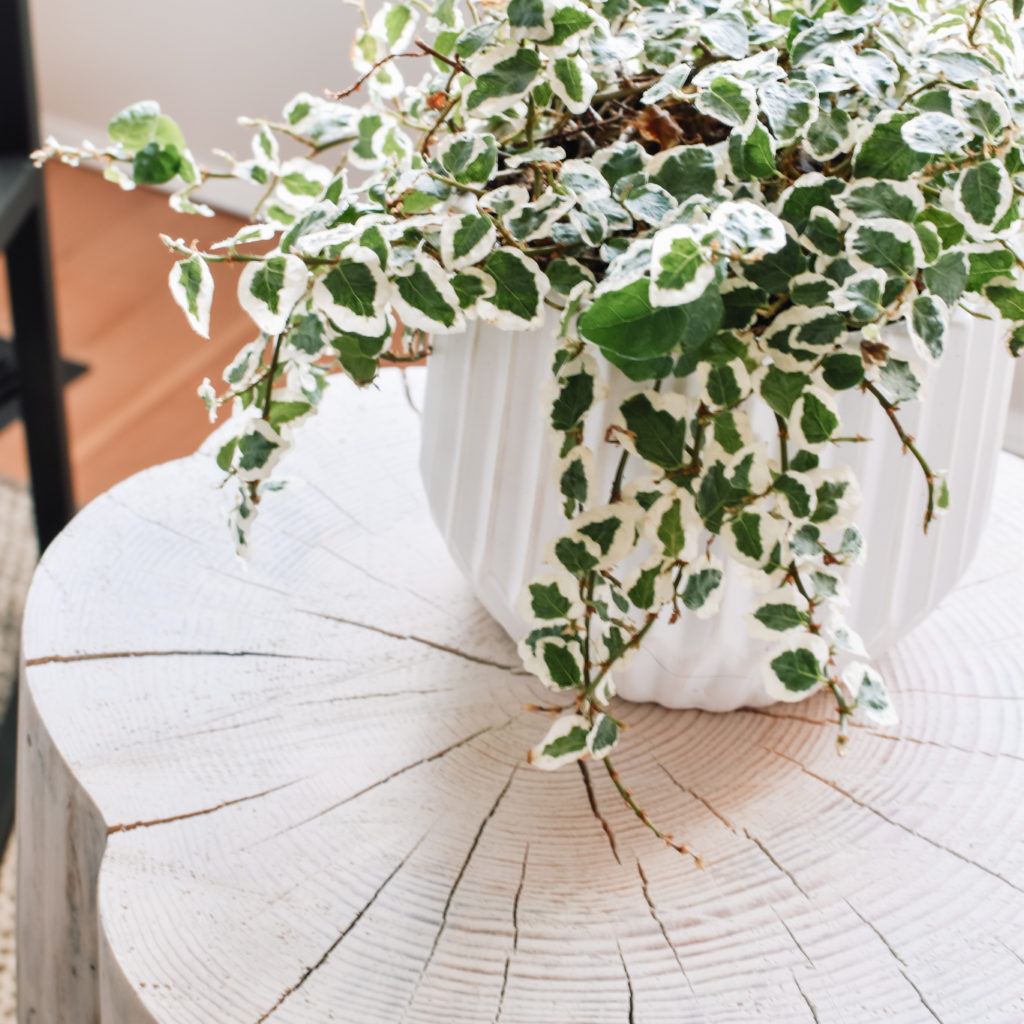
It was a pretty simple project too – strip off the bark with a chisel and hammer, sand it down, and white wash it. I absolutely adore the beautiful pattern made by the cracks as it dried and acclimatized to our home.
Curtains
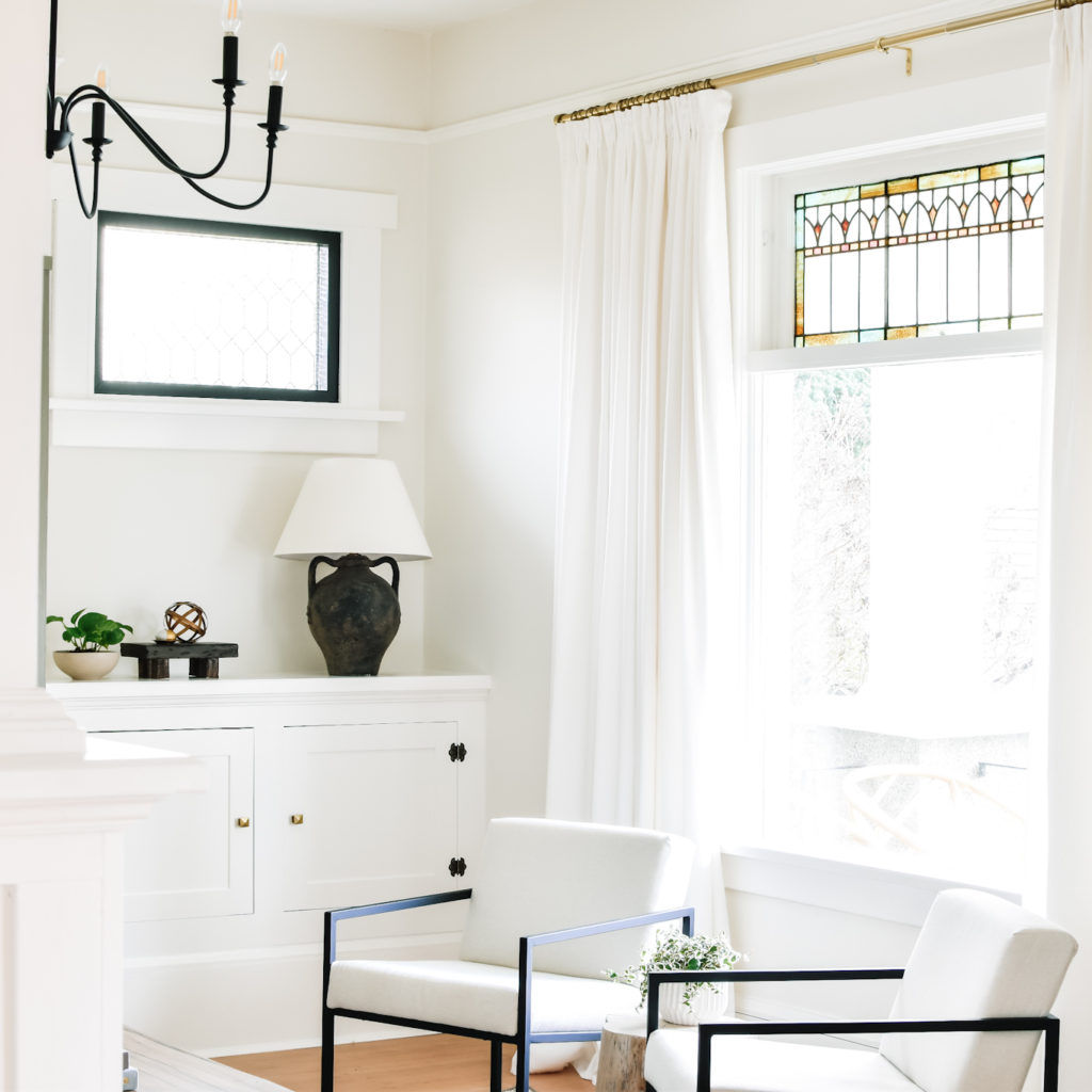
Since I’m all about that high end look for less, I needed to figure out a way to get the look of custom drapes without the price tag. I ended up stacking two panels of IKEA Tibast drapes on either side of the window. The key to getting the elevated look is to hang them using pleating hooks and curtain rings.
You can hop on over to my Instagram highlights for a full video tutorial on how to achieve this look for your own home.
Sconces and Gallery Wall
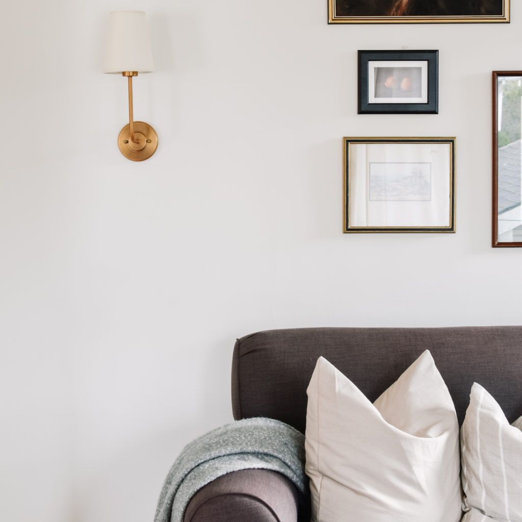
I wanted this room to be anchored by traditional design elements to give the space a bit of gravitas.
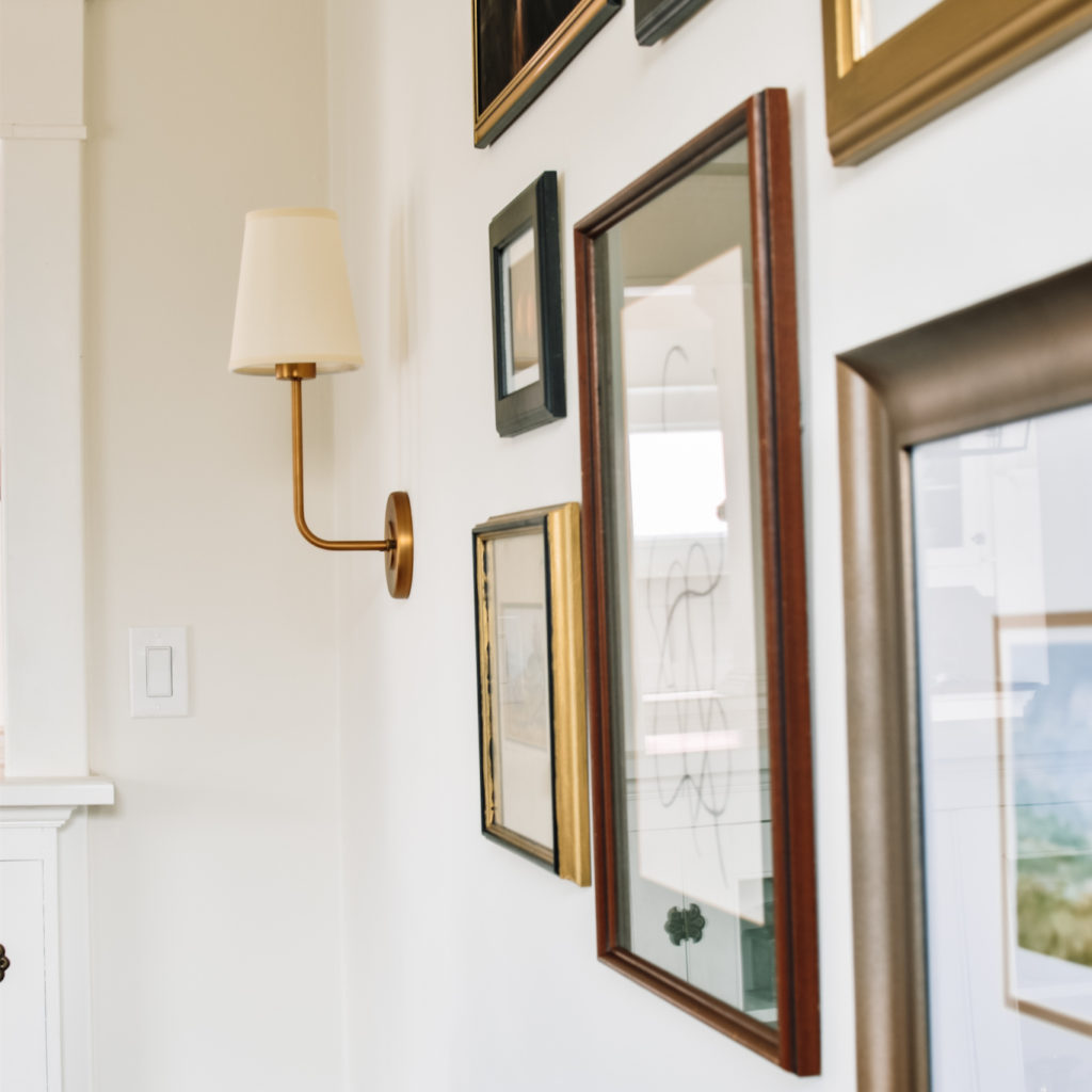
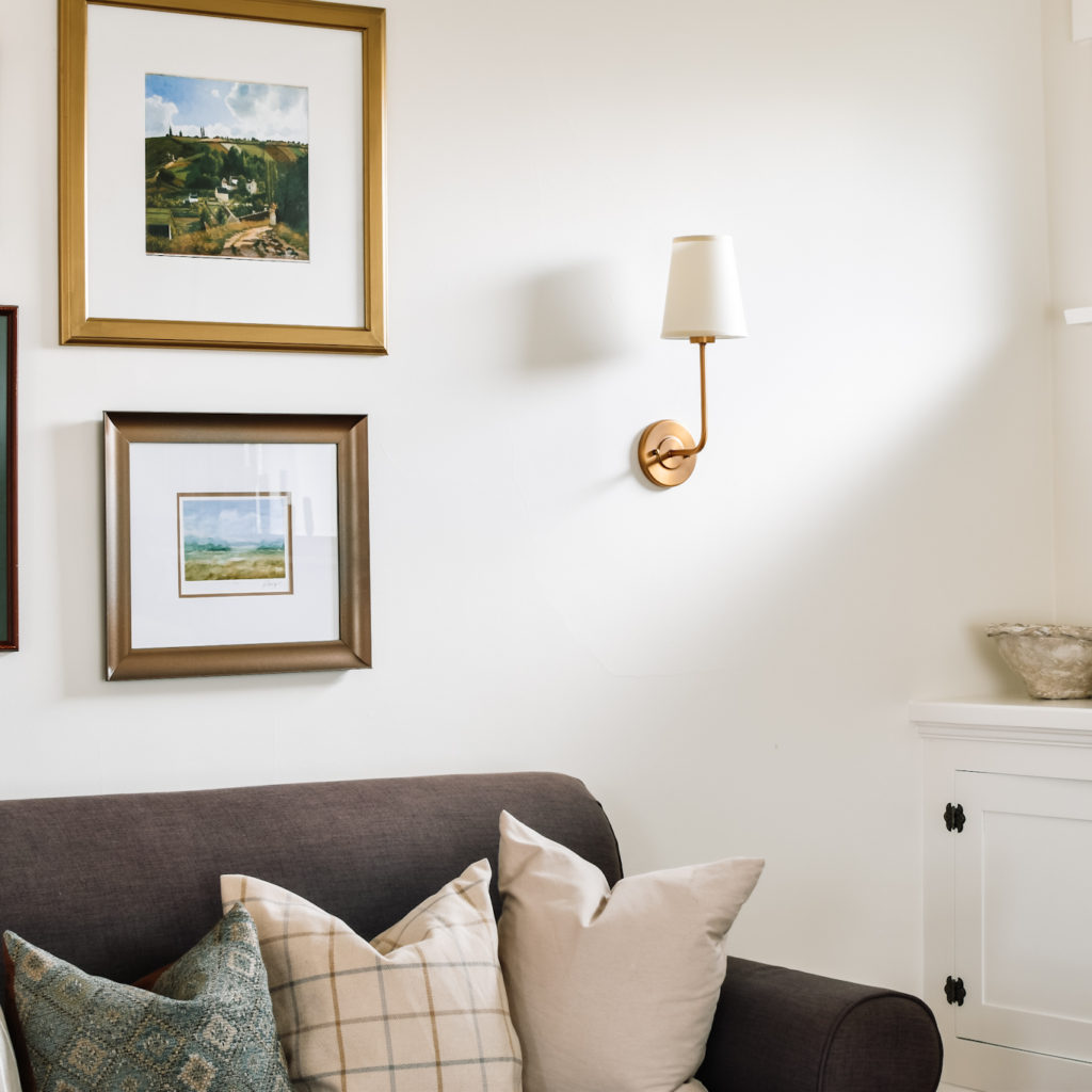
My original design plan for this space called for panel moulding on this wall as well as flanking the stained glass window. However as we built out the cabinets around the fireplace it became difficult to see how to incorporate them in a symmetrical way. For now, we’ve put a pin in this specific element, though we may come back to it one day. It’s another one of those traditional elements that adds formality and interest to a space.
Restoring the Original Built-ins
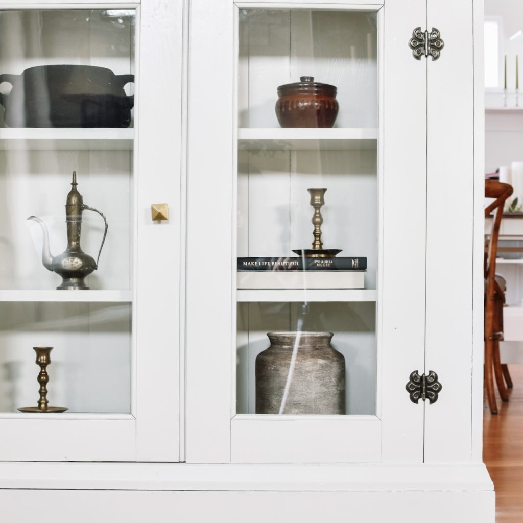
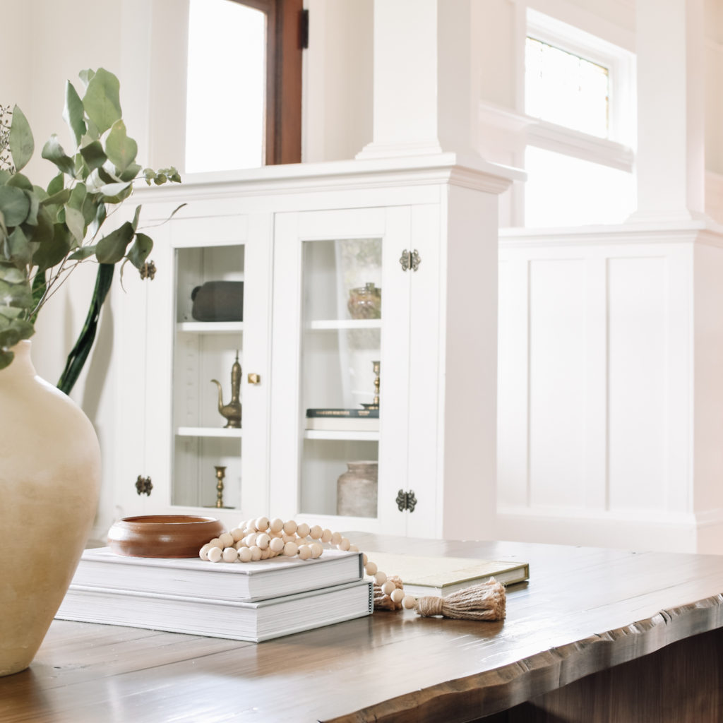
When we purchased the home, these doors were sitting in the basement with cracked and missing glass. We replaced the glass and were able to source replica brass butterfly hinges to match the rest of the home’s built-ins (which were also used on the new cabinetry).
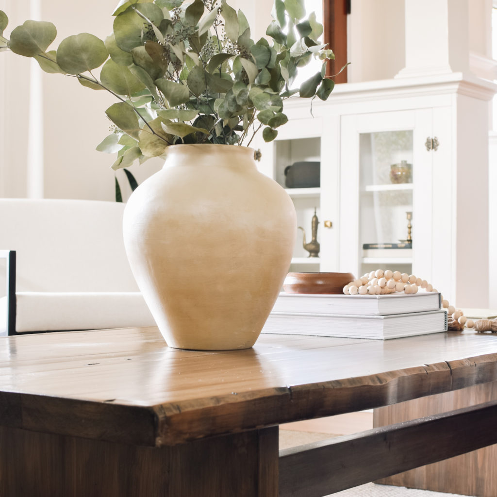
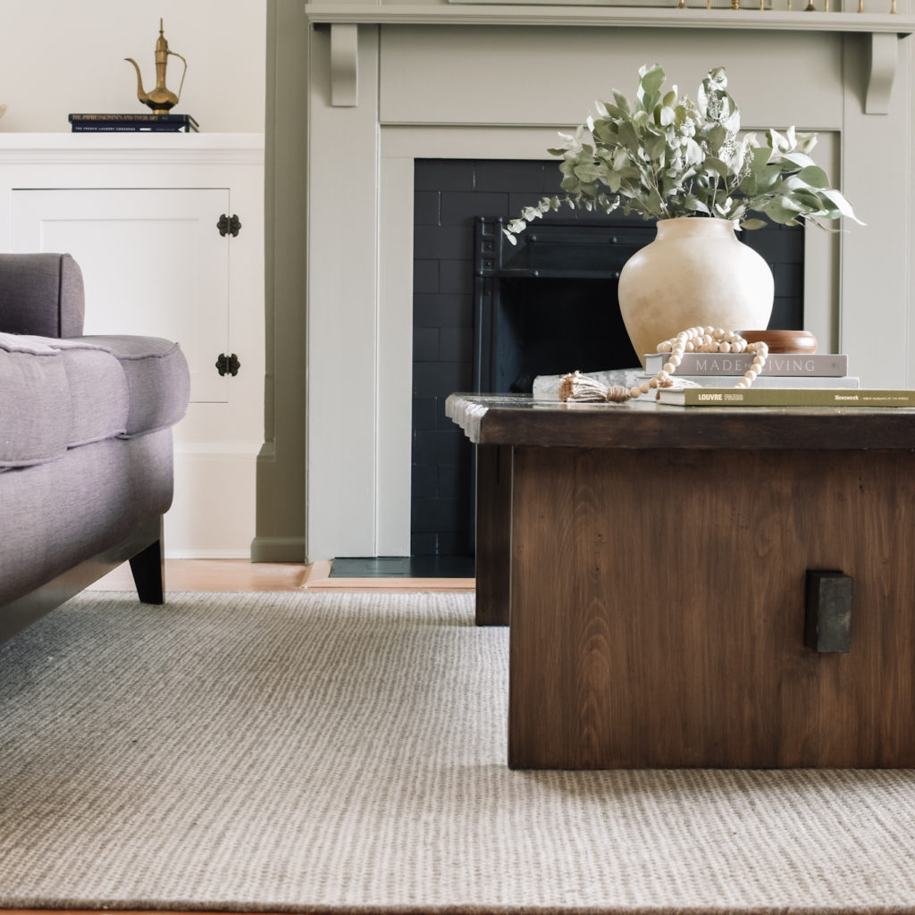
Coffee Table
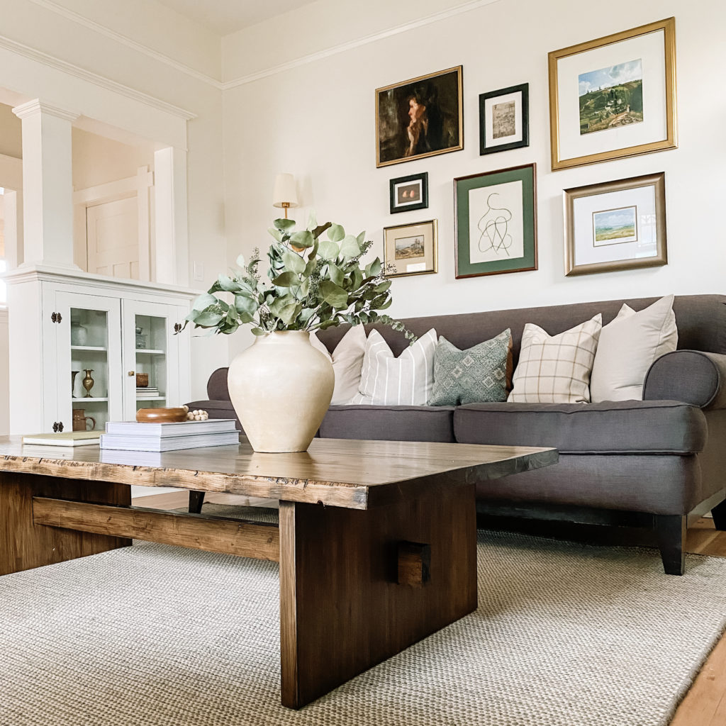
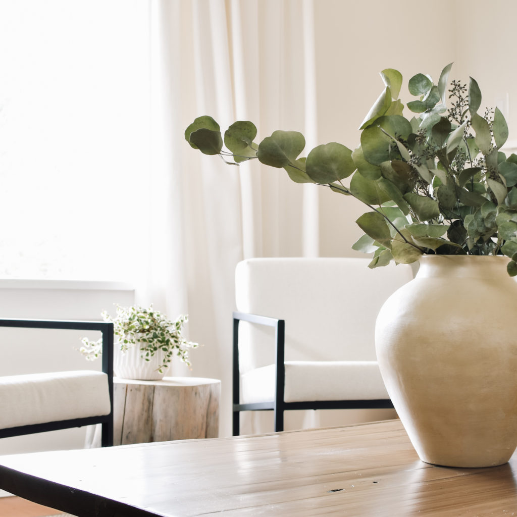
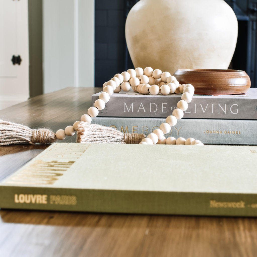
Last, but certainly not least, the coffee table. My husband definitely thought I was nuts when I showed him my vision for this piece – large (6′ long!) and visually heavy, it’s different than my usual style. Not that he doesn’t love it too, in fact it’s much more to his taste than mine.
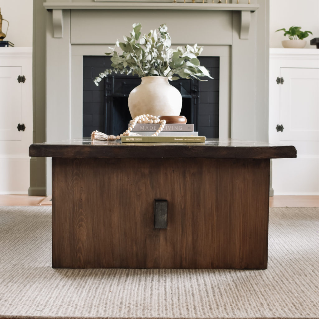
I wanted this room to feel elevated but casual, and I think the subtly rustic table adds the perfect counterpoint to the more formal and traditional elements in the room.

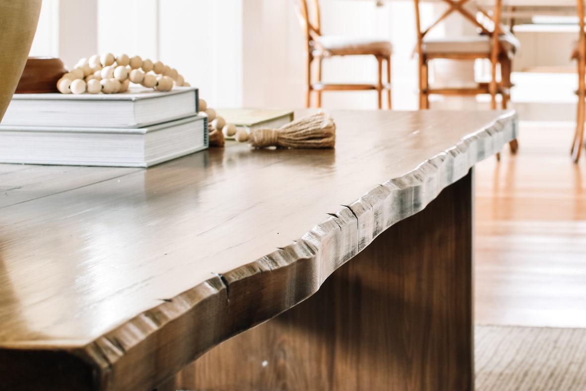
This faux live edge is my favourite detail on this piece.
It would be hard to choose my favourite element in the room, but this coffee table is a strong contender. Of all the things I’ve ever built, I think this is the one I’m most proud of.
Final Thoughts
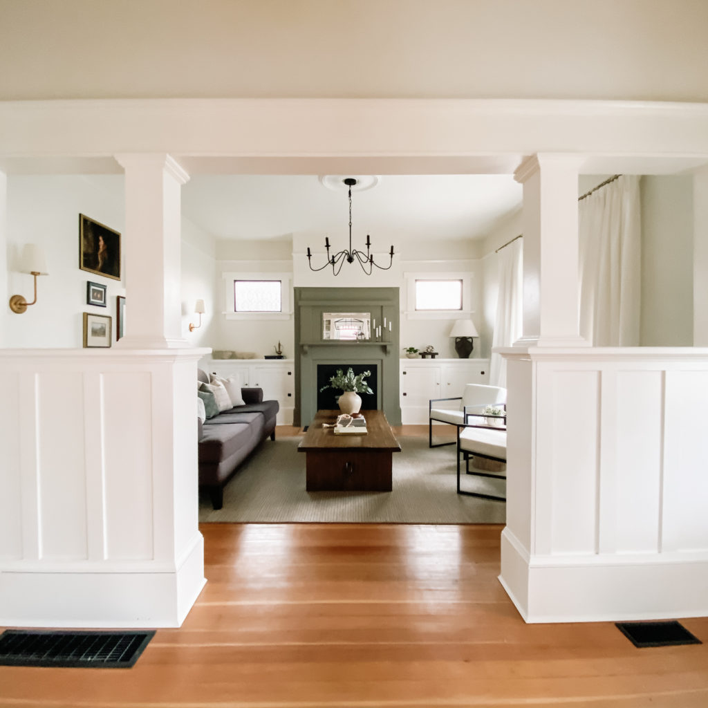
The ORC has been a challenge alright, but I couldn’t be more pleased with how the space has come together. I could not have done it without my incredible husband, who is always cheering me on and helping me bring my vision to life.
I’ve saved a video walkthrough in my Instagram highlights (in the one titled ORC pt.3) so you can get a feel for the room “in person.” As always, I love to hear your thoughts on the space in the comment section below. Thank you to each and every one of you that has been cheering us on throughout this journey! I so appreciate you.
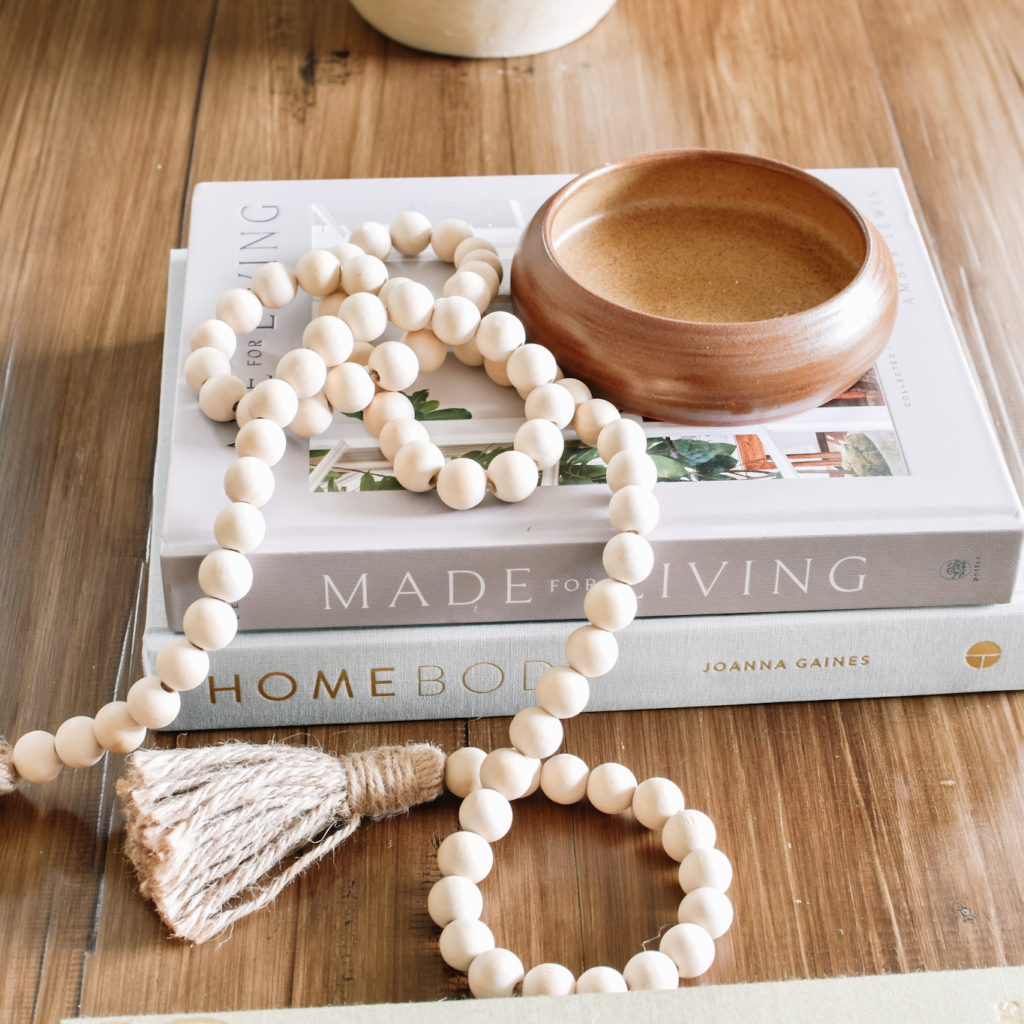
I know I’ll get questions about sources, so I’ve linked them or similar below, where possible. If I forgot anything, just ask for the source in the comment section and I’d be happy to share additional info!
Now its time to put my feet up and enjoy this space, the best part of any renovation, don’t you think?
XO,

P.S. – You can check out the ORC featured designers and the other guest participants here. Scope out their incredible transformations, I have loved following along!


This room is beautiful!! I love how the coffee table balances out the rest of the room. Also, you did great on your photography!
This is incredible!! What a wonderful historic home you have, that fireplace is so special! I love the colors you chose and the open feel it has while still being so interesting! Great job!!
That green is so beautiful! What a lovely refresh of a gorgeous room!
what a gorgeous living room! Love the serenity sensibility and the hits of black for sophistication and to help ground the space. That chandelier has great scale and I am so jealous of you with that table lamp!!! It’s BEAUTIFUL! can’t believe you have transformed those armchairs yourself and that fireplace color … spot on!
Your living room transformation is gorgeous! Love how you painted the fireplace that pretty green and the gallery wall is stunning. Great job!