6 Tried & True White Paint Colours to Consider When Painting Your Home
Picking a white paint colour may seem like a straightforward task, but when confronted with the myriad of options available, it easily becomes overwhelming.
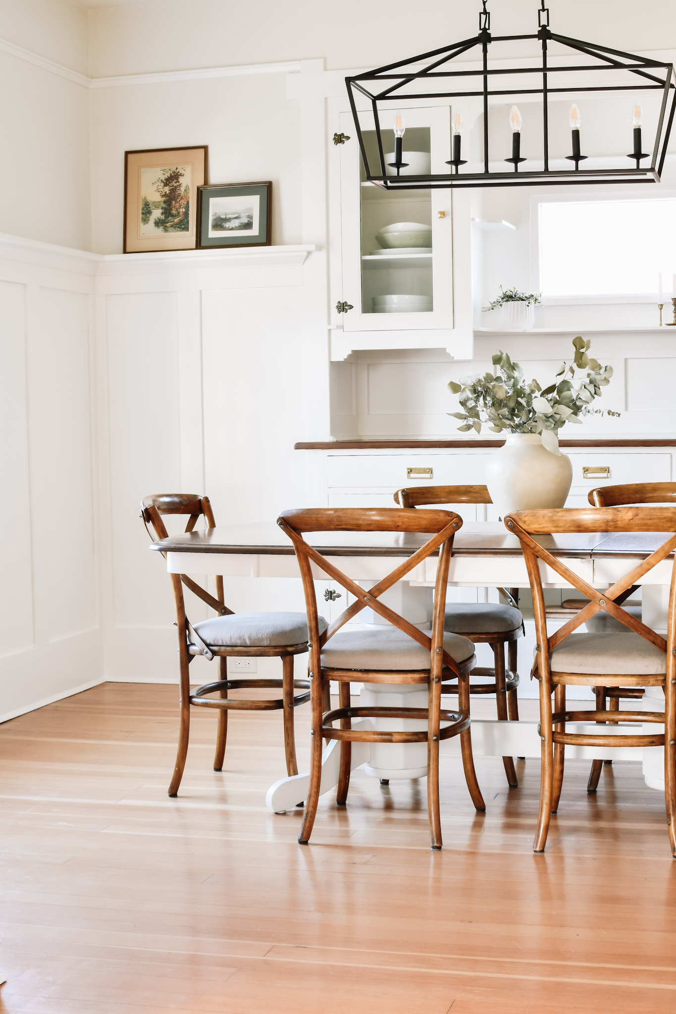
As anyone who has looked at white paint chips knows, there is no one “white” paint. There are cool whites, neutral whites, and warm whites. The way each of these whites look is drastically affected by the room’s exposure (we’ll get into that in a minute) and the sunlight as it changes through the day. Additionally, white easily picks up the tones which are reflected in the space – think furnishings, green from landscaping, the reflection of a pool, etc.
All these factors make white the trickiest paint colour to select. Read on for my 6 favourite whites of all time, examples of each, undertone details, as well as tips on what to consider when choosing white paint.
This post may contain affiliate links, and I may earn a small commission at no additional cost to you. As an Amazon Associate I earn from qualifying purchases. You can read my full disclosure here.
The Most Common Mistake When Choosing a White Paint
One of the most common mistakes is comparing white samples directly to each other. If you were to hold the chips of say, Benjamin Moore Chantilly Lace and Swiss Coffee next to each other, it would appear that Swiss Coffee is not really white at all – when in fact both are white!

Chantilly Lace is a neutral, crisp white, while Swiss Coffee is a warm, creamy white. Each is beautiful in its own way, it all depends on the vibe you are trying to achieve in your space – crisp and modern, or warm and inviting?
This is why it’s important to consider and sample the colours independent of each other. Unless you are planning to use both colours in the same space, comparing them side by side is typically more confusing than useful.
How Exposure Changes the Way a Paint Colour Appears
One critical element that is often overlooked is the effect of the room’s exposure on the paint tone. Different exposures all play with colour in varied ways. Here’s what to keep in mind:
North Exposure: North facing rooms have a considerably cooler exterior light source. This casts a grey-blue hue in the space, which can make the room feel cold and uninviting, cool whites tend to exacerbate this effect. If you’d like to balance out the cool grey light, use a warmer toned white.
South Exposure: As you might imagine, a room bathed in sunlight has a warm light source. The important factor to consider here is how the light changes throughout the day – a white that looks perfect in the morning may be washed out by midday sun, just as a white that looks perfect at midday may feel too saturated in the evening. By taking note of the colour changes throughout the day, you can find which one strikes the right balance for your taste.
East Exposure: Rooms that get morning light lean toward the cooler side. The room will be bright in the morning, and shadowy as the day progresses, making them one of the tricker exposures to work with. A white that is too warm can look muddy in the space, a cool white can feel too stark. A true white (neither warm nor cool) can balance out the changing light conditions the space.
West Exposure: A West exposure will have the characteristics of a North Exposure in the morning, and the characteristics of a Southern Exposure in the afternoon. As the warm light pours in the the afternoon, the colour will appear more warm but also a little more washed out. I’d recommend thinking about when you spend the most time in the room – and choosing the colour you think looks best at that time of day.
No matter your room’s exposure – be sure to observe how the light plays with the colour throughout a day (or two!) before making your decision.
The Simplest Way to Incorporate White Paint in Your Home
If you are after a fail-safe way to use white in your interior, you can’t go wrong painting the walls, trim, and baseboards the same shade of white. This is because when you start mixing whites, things can get a little tricky as one may pull out unfavourable undertones in the other. Using the same tone throughout eliminates this concern.
You may think that the same paint colour throughout would look boring, however the key is using different sheens on each surface to give the paint a different appearance. The slight difference in sheen makes the paint appear different to the eye (the higher sheen paint will look brighter) without any issues of clashing hues.
White paint shouldn’t feel this hard, right?
You’re not alone—and you don’t have to keep spinning your wheels.
I’ve created an entire guide to empower you with you the clarity and confidence you need to pick a paint color you’ll actually LOVE.
What Paint Finish Should I Use?
For moulding and baseboards, I always recommend a pearl finish. It provides some sheen and increased scrubability, without the high shine factor of eggshell or semi-gloss paint.
For walls, matte paint is my sheen of choice as it is both current and timeless. Forget the chalky version of flat paint you have in your mind, matte paint is sophisticated, soft and smooth, and covers imperfections beautifully. Any amount of sheen will amplify bumps, patches, or dents in your wall, and who wants to highlight that?
An added bonus of matte paint is that touch-ups are easily done without leaving the tell-tale patch line on the wall, negating the need to repaint a whole wall just for one touch-up.
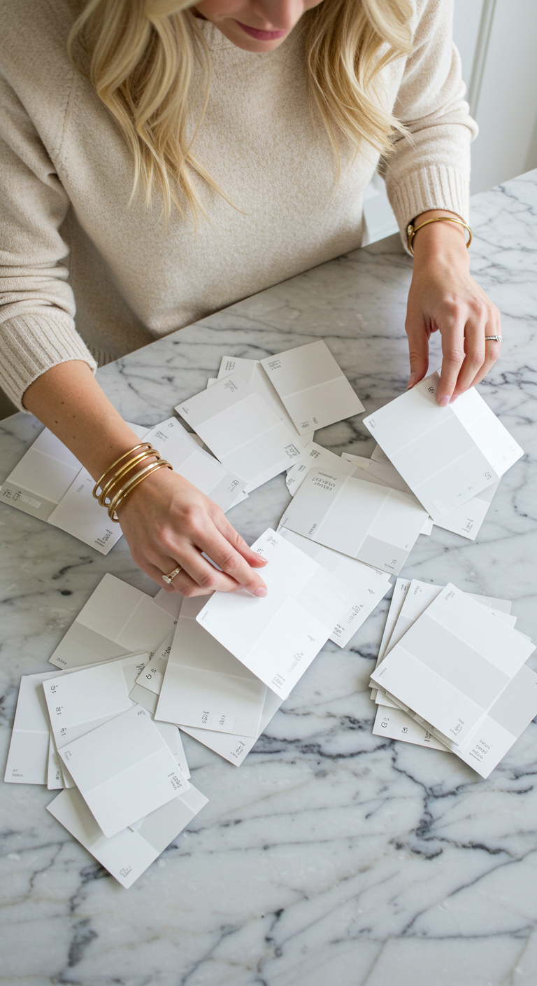
How to Choose Your Favourite White Paint
- Narrow your selection to 3-4 contenders
- Sample each on two different walls in the space – the colour will look different depending on the wall’s exposure. I’d recommend at least a 2’x2′ sample of each paint. For ease of moving colours around the space, painting samples on a 2×2’ board can be helpful.
- Observe the colour at various times of day to see how the colour changes with the daylight (and under artificial light!)
- If you are not repainting your trim, test it next to your trim colour
My 6 Favourite White Paint Colours
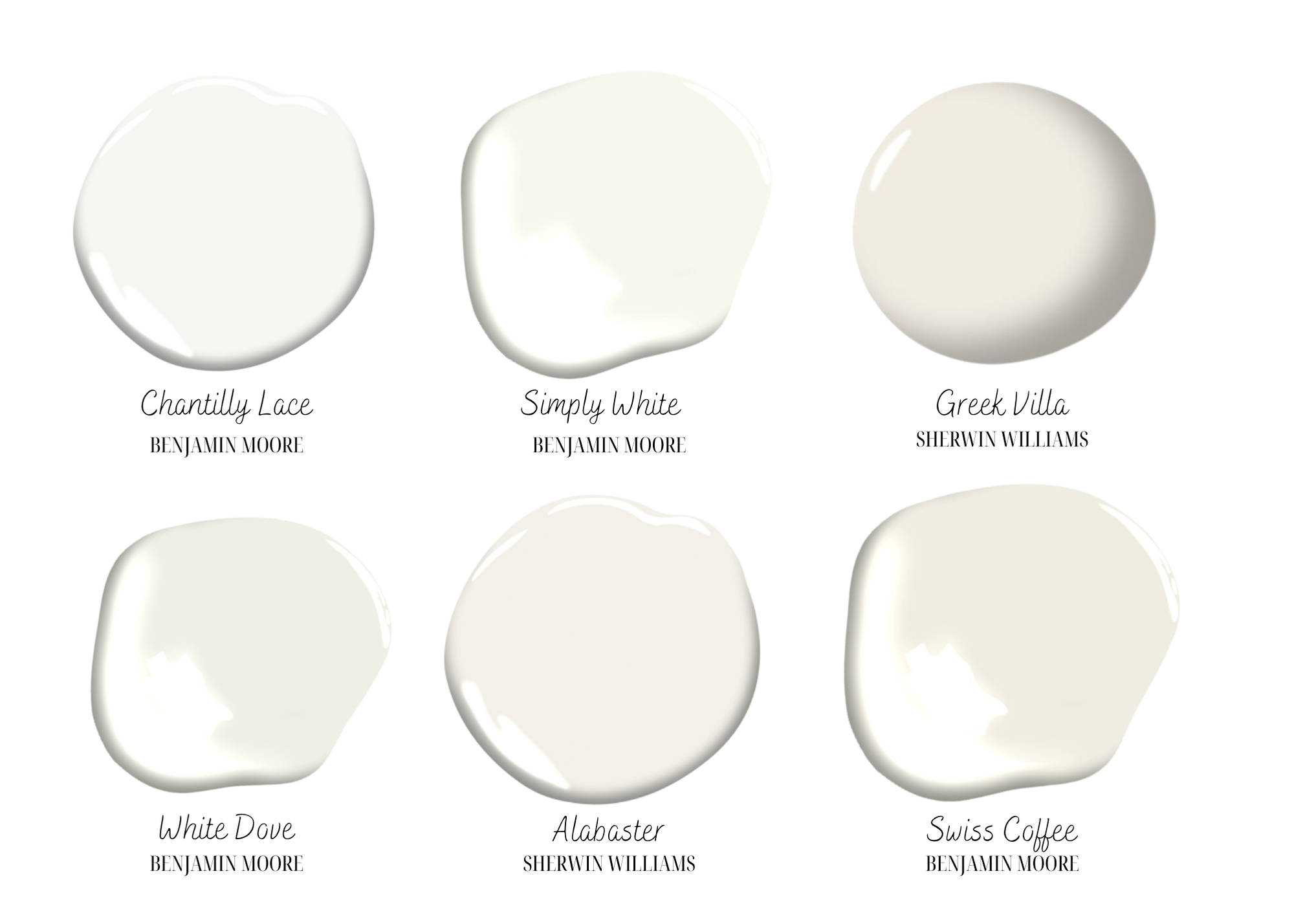
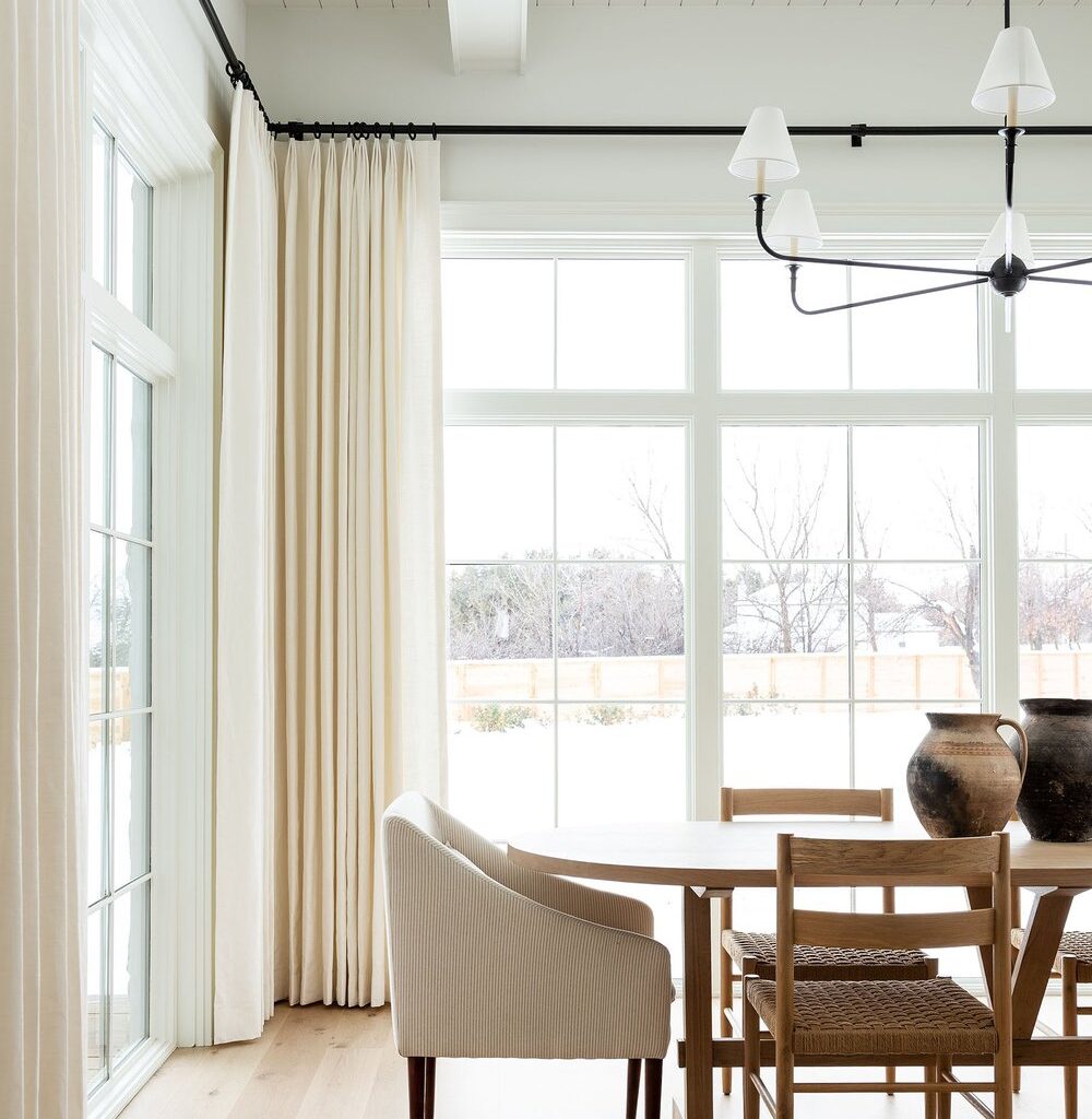
Benjamin Moore Chantilly Lace (OC-65)
Chantilly Lace is the “coolest” white in this list, though it may be more properly be described as neutral (neither cool nor warm). It is incredibly versatile in that it is equally suited to both traditional and modern spaces. It is crisp without feeling cold.
If you are looking for a clean, bright space, look no further than Chantilly Lace.
Certainly not just for walls, Chantilly Lace is an excellent choice for crisp white cabinetry.
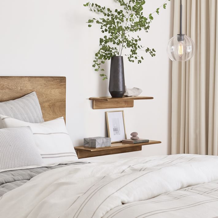
Benjamin Moore White Dove (OC-17)
White Dove is a warm white that leans slightly grey. If you want a warm white but are concerned about seeing too much yellow undertone, this may just be the white for you.
Benjamin Moore describes White Dove as light and luminous, which is a very fitting description.
Feeling stuck on paint colors?
Get the guide that helps you trust your gut and love your space.
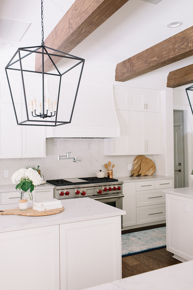
Sherwin Williams Greek Villa (SW 7551)
One of my favourite neutral whites, Greek Villa is soft and inviting. When compared to other whites it leans warm, but on its own feels fresh and bright.
Note how in the photo below, Greek Villa looks bright and clean, but when compared to the white towel you can see how soft and warm the colour is.
Benjamin Moore Simply White (OC-117)
If you want a paint that reads as a true white, but without the sometimes stark feel of cool toned whites, Simply White is a strong contender.
Simply White has yellow undertones, so when compared side by side to other whites, it can look very warm. But when used exclusively in a room (on both walls and trim), it reads as a soft white – fresh but inviting.
Sherwin Williams Alabaster (SW7008)
Alabaster is a gorgeous white that leans slightly warmer and saturated than the whites we’ve already covered.
In a sun-filled room, Alabaster will read as airy, warm white. In north facing or otherwise darker spaces, expect the warm tones to be amplified and it will read as a slightly more “saturated” white due to reduced natural light.
Alabaster is a beautiful choice for a warm cozy white that feels still feels clean and bright.
Benjamin Moore Swiss Coffee (OC-45)
The warmest of the Top 6, Swiss Coffee will really up the cozy factor of your space. It’s creamy white that leans almost off-white and looks just as beautiful on cabinetry as it does on walls.
I hope you’ve found inspiration in these images on which shade of white paint that speaks most to you. Now take your favourites and test them in your own home!
Final Thoughts on Choosing the Right Paint
One final tip – those colour “blobs” that are in the graphic above, are all over Pinterest, and on paint manufacturer’s websites DO NOT in any way capture how a paint looks in real life. They may be helpful in seeing the undertones, but take them with a significant grain of salt.
I’ve always found inspiration images (such as above) to be the best starting point, keeping in mind they may be edited significantly and the paint will undoubtedly look different in your space. But in my opinion, inspiration images are a much better jumping off point than a paint deck full of endless (read: confusing) options.
These are the exact methods I’ve used to pick white paint for my own home (I’ve used both Simply White and Alabaster, in case you were wondering!) and I truly believe it’s the best way to confidently select a paint colour you love.
Any questions? Feel free to drop a question below or come visit over on Instagram to connect.
P.S. – Don’t forget to Pin this post to refer back to!

Still second-guessing between warm and cool whites? Paint with Confidence is your next step. It’s a friendly, beginner-friendly guide that helps you feel sure of your choices — not just for white, but for every colour in your home. If you’re tired of holding up swatches and hoping for the best, this is for you.
